Interview – Kim Wong

Tell us about yourself.

My name is Kim Wong, I worked as a digital journalist with Channel NewsAsia. I’m Malaysian.

How did you get into the field you are in now?

A friend of mine told me there was an opening and they were looking for someone who was interested in telling stories. I came from a business degree background so I had absolutely no knowledge of production or journalism. But I was interested in photography and videography having done some on the side in university. So i basically showed them my instagram photos and a travel video I did up, they thought i had an eye visually and thats how I got the job.

What motivates you to keep doing what you do? 

That I was able to tell stories of ordinary Singaporeans and issues to a wider audience, and helping people be more aware of what is around us. It was accomplishing knowing how some stories were life changing and to be able to share that was motivating enough.

Could you imagine yourself doing any other job than the one you’re doing now?

Yes, the job scope was not just being a digital journalist but also at the same time we had to manage our social platforms and run a facebook page. Which means a business/marketing mindset in knowing what works and what does not too. So with that knowledge and background, I could go into social media marketing work and telling stories but from a business point of view.

If you could go back in time and do something differently what would it be?

I would have pushed myself more, in terms of getting out of my comfort zone, and honing better interview skills in getting out the best stories that I could. I could have challenged myself more as well in terms of the visual elements (shooting, camera angles etc) to tell a better story visually.

One piece of advice you would give someone starting out in the creative field?

Take in constructive criticism and learn from it. Don’t think that just because you have a great idea, it is a great idea and will work. No. You’re gonna have great ideas, and you’re gonna have stupid ideas that you feel the need to execute, but take a moment to look at things from a different perspective, talk to other people, and find out how those comments from others can help make your work better.

Kim can be found on Instagram @iamkimwong

The Digital Photography Book – Scott Kelby

Scott Kelby’s Digital Photography Book was one of the first books that I read as an aspiring photographer, and was definitely one of the best. Originally published in 2006, over the years it has been updated and revised as well have new books added to the series. As of the time of writing, there are 5 volumes available, each continuing where the previous book left off.

The idea behind the books is to explain concepts easily, without too much technical jargon. This excerpt from Scott sums it up best.

“If you and I were out on a shoot and you asked me, ‘Hey Scott, I want the light for this portrait to look really soft and flattering. How far back should I put this softbox?’ I wouldn’t give you a lecture about lighting ratios, or flash modifiers. In real life, I’d just turn to you and say, ‘Move it in as close to your subject as you possibly can, without it actually showing up in the shot.’ Well, that’s what this book is all about: you and I out shooting where I answer questions, give you advice, and share the secrets I’ve learned, just like I would with a friend–without all the technical explanations and techie photo speak.”

The story set as if you and Scott are two friends out on a shoot. The books are broken down into several chapters, each focusing on a certain type of photography, i.e. weddings, sports, landscapes, portraits, etc. Each page within the chapters presents a particular tip or technique, conveying it a simple, straight forward manner. It mostly avoids getting too technical, rather it simply focuses on what you need to do or what settings you need to change to achieve a certain kind of shot.

Screen Shot 2017-09-14 at 9.02.46 AM.png
Excerpt from The Digital Photography Book Volume 3 (Kelby, 2009)

The books are filled with Scott’s light hearted humor and puns. This serves to lighten the mood of the book, helping to turn it into a fun read instead of a textbook. This is what makes Scott’s series stand out from the other photography books out there. It’s fun.

Some key things that I learned from the books – 

  1. Holding the camera steady (Scott shared a technique about how to wrap the camera strap around your arm to achieve better stability.)
  2. Framing (Where to crop your portraits.)
  3. Perspective (Using a wide angle vs using a zoom to achieve very different effects)

Scott’s books are one of the best selling photography books in the world – and for good reason. If you’re a beginner just starting out in photography, these books will definitely help you learn what you need to know to capture better pictures. And if you’re a seasoned photographer, these books make a great read – and you might learn something new too.

part5cvr
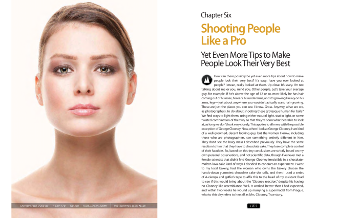
At the end of each book Scott presents some of his photos and tells you exactly how he achieved that result. All of these and more, are compiled into volume 5 of The Digital Photography Book. So if you want to know more about how Scott shoots his subjects, and his exact thought process and workflow, book 5 is worth exploring.

The Digital Photography Books are available to purchase as physical copies or ebooks on Amazon.

References

Kelby, S. (2006). The digital photography book. volume 1: The step-by-step secrets for how to make your photos look like the pros’! Berkeley, CA: Peachpit Press.

Kelby, S. (2008). The digital photography book: The step-by-step secrets for how to make your photos look like the pros! Berkeley, CA: Peachpit Press.

Kelby, S. (2009). The digital photography book: The step-by-step secrets for how to make your photos look like the pros’! : Volume 3. Berkeley, Calif.: Peachpit Press.

Kelby, S. (2012). The digital photography book, part 4: The step-by-step secrets for how to make your photos look like the pros’! Berkeley, CA: Peachpit.

Style Analysis – Mark Singerman

Introduction

Presenting the fourth post in the Style Analysis series. The idea behind this series is to help form a better understanding of various photography and editing styles and methods.

Point to note – photography is subjective. This is not a post pointing out what I think are “good” and “bad” photos, rather I’m trying to take a fairly objective view and simply examine the techniques and style preferences of the photographers.

Mark Singerman

Mark Singerman is a portrait photographer. His photography can be found on Instagram @marksingerman and on his website.

Photography

While Mark does shoot various types of photos, which can be found on his website, the focus for this post are his vibrant portraits. Portraiture was chosen simply because that’s what his Instagram account focuses on.

21294463_103590587048599_671098608619094016_n

  • Color

Color-wise, at first glance the photos do have some resemblance to Brandon Woelfel’s style, but upon closer inspection the differences become more obvious. Firstly, Mark’s photos are warmer and focus on the blues and oranges, while Brandon’s pictures are cooler, more desaturated and have a tint leaning more to the pink side. These are fairly simple variations, but provide the photographers with two vastly different styles. Another point to note is that Mark’s alters the blues to be more aqua, something that seems to be an increasingly more common trend on the Instagram.

  • Composition

The models in the photos are placed almost always in the center, putting the focus on them, and creating a pleasing symmetry to the image. There aren’t any extreme camera angles, with the camera placed more or less around eye level. The portraits are usually framed as a mid-shot or close-up, rarely showing the entire person, but instead focusing more on their face and expression.

  • Props

Mark also uses props such as prisms, sparklers and fairy lights to add some flair to his photos. The props coupled with the bokeh caused by a large aperture lens, give the images an extra element to them, although they’re not used in every picture and Mark ‘s style doesn’t rely on them as much as, Brandon Woelfel.

Conclusion

As usual, this is not meant to be an detailed analysis, but simply my observations. Have you notice anything else in Mark’s style? Leave a comment if you did!

Refrences

Singerman, M. (2017). [photograph]. Retrieved from https://www.instagram.com/marksingerman

Interview – Mahesh Ravi

Mahesh Ravi is a Multimedia Generalist, currently residing in Bangalore, India. He works in various mediums, including photography, filmmaking and design.

Below is a short transcript of the interview. The full interview can be found at the bottom of this post.

How did you get into the field you are in now?

Since my childhood, I’ve been really interested in visual design. I’ve always wanted to study film design, but at that time I didn’t even know there was such a discipline. It was at that point I realized that I was an artist and wanted to do something really creative. The main reason I chose multimedia was the leverage I would be getting to work in mixed media, which I’ve always loved to do – and still do. I love the combinations of analogue and digital media, and combining film with an aspect of design, and photography with an aspect of typography.

What motivates you to keep doing what you do?

I think when you’re in this field, your motivation is what’s happening in the world around you. You’ll constantly be in touch with what your competitor is doing, what your friends are doing, what’s the latest in technology and art. It’s a very competitive world and if you want to be on top of something you need to continuously push yourself beyond your limits. It [motivation] can be anything, from a good piece of music or a good photograph.

Could you imagine yourself doing any other job than the one you’re doing now?

I can imagine myself in another title that’s not connected to the creative field, but I know for a fact I won’t be very good at that.

If you could go back in time and do something differently what would it be?

It’s very difficult to answer this question, because every artist who is constantly improving would want to go back and change something in a design or film that they’ve made. I can’t say one particular decision that I’ve made in my life, which I’d go back and change, it’s not my way of thinking about what I do. I’d rather use my time to focus on the future than thinking about changing the past.

If I could go back in time, I wouldn’t do anything differently, I’d just take my camera, shoot a couple of scenes, come back and claim it as the most realistic and most authentic retro film ever made.

20891708_10156634691899768_1079359135_n

One piece of advice you would give someone starting out in the creative field?

If you want to be in the creative field, no matter what discipline – it can be photography, design, film – it is really important that you get enough exposure about what’s happening in that particular media. Even before you start something, you need to have done some research on it. Keep yourself updated with what is currently happening in your field. Be very good observers and choose your artistic integrity wisely.

More information about Mahesh and his work can be found at his website.

The full interview can be found below.

Style Analysis – Bobby Vu

Introduction

This is the third post in a short series that will focus on forming an analysis on a selected photographers works. The idea behind this is to form a better understanding of various photography and editing styles and methods and to eventually create my own style. The end goal of this series is to eventually create my own unique style of photography whereby I will at a later point create an Instagram account to showcase.

Point to note – photography is subjective. This is not a post pointing out what I think are “good” and “bad” photos, rather I’m trying to take a fairly objective view and simply examine the techniques and style preferences of the photographers.

Bobby Vu

Bobby Vu is a film director and photographer based in Los Angeles. His photography can be found on Instagram @kingvuddha while his latest film project can be found here. More information can be found on his website.

19623272_1321114928005845_7934697709921894400_n

Photography

Bobby shoots portraits, around the city and during his travels with a distinctly old school vibe. His photos tend to reflect the feel and style that he creates his videos in. For his photography, he uses a Nikon D750 with lenses such as the 35mm f/1.4 and 50mm f/1.4.

  • Color

The first thing about any photo that I notice is the color. Most of Bobby’s photos have a desaturated look, with all the colors toned down. However a lot of his photos incorporate neons, or other light sources and in these cases the color of the light is made to pop just a little bit more. Another point to note is that the blues are usually edited to be more aqua, which seems to be a popular Instagram look these days. Lastly, the photos lean ever so slightly to the green side of the tint slider.

  • Model

Bobby’s photos are almost exclusively portraits, and as such the model plays an important part in the frame. The model is almost never made to smile, rather maintaining a more neutral expression. In certain shots the model looks away from the camera, conveying a distant, dreamy expression, while other shots have the model looking straight at the viewer. Both of these looks portray a sad, moody emotion.

  • Composition

Composition-wise, the photos are relatively simple. The subject is usually centered and the camera is placed at eye level with the subject, making the person look “real” instead of the over dramatized look provided by positioning the camera at very high or very low angles. The background is very plain and in a single color for studio shots, while outdoors a large aperture is used to blur it out and create bokeh.

Conclusion

These are a few key points that I have noted from Bobby Vu’s photos. As usual, this is not meant to be an detailed analysis, but simply my observations, meant to help me develop my own visual style. Did you notice anything else? Leave a comment if you did!

Refrences

Vu, B. (2017). [photograph]. Retrieved from https://www.instagram.com/kingvuddha

Project Analysis – Conversation Animation II

This project analysis is a critical analysis done on a previous animation project that I’ve worked on. While my primary focus is on the photography and film field, I find it is still useful to learn from projects in slightly different mediums. Owing to it’s length this post is split into two parts.

This is the second part. The first part can be found here.

Contextual Research

Introduction

This chapter outlines the contextual research for the project discussed in this paper. The final output that was required for the project was video. Due to the content that is being presented, it was decided to make the project an animation.

Animation and Motion Graphics

Animation is essentially the “the act of creating the illusion of movement through still images” (Zeke, 2015). In a way then, animation can be traced back to  cave paintings and various ancient art works, for example, pottery from Shahr-e Sukhteh, Iran, around 3000 B.C., which depict a goat leaping (Miller, 2015). More recently, tools such as the Magic Lantern (an image projector which used  sheets of glass), the Phenakitoscope (a spinning disk with images on it), and the Kineograph (more commonly known as a flip-book) are also considered as part of animation history (“History of animation,” 2015). Eventually in the 1900s animation evolved into the cartoons that people today are familiar with. However the project isn’t a traditional animation, rather it is classified as motion graphics. Motion graphics can be defined as the “art of creatively moving graphic elements or texts, usually for commercial or promotional purposes” (“5 types of animation – a beginner’s guide,” n.d.). They are usually flat images or 3D objects that have the effect of motion. Primarily they are used for title scenes, animated logos, promotional videos, and etc.

Motion graphics has an advantage over still images, such as posters. One of the advantages, being the ability to have more content. Where a poster would be one frame, a video has multiple. The conversation stack, discussed earlier in the report, is linear, there is a certain order to it – it has a specific starting point and ending point. This translates well into a video, which is able to show the step by step process better.

Design Style

Design-wise, the project went with a simple, minimal look and feel. This was chosen after various experiments because it was kept the video simple, moving  focus to the content instead. Minimalism started in the 20th century, and continues to be a popular trend today (Mokhov, 2011). It has influenced almost all arts and technologies from the late 20th century (Ivanoff, 2014). Everything from artworks to  architecture to automobiles to UI/UX design, games,  products, films, and more. Notable uses of the design can be found everywhere. For example, in products such as the iPhone and MacBook, operating systems such as Android and iOS, as well as most modern apps and websites. According to  Mokhov (2011), minimalistic design was influenced by the De Stijl art movement, architects like Van Der Rohe, and traditional Japanese design. All of these styles focused on fewer elements with simple lines and form. As Van Der Rohe famously said, “Less is more.”

Future Development

Introduction

This chapter will discuss the future development of the project, and outline any possible changes or improvements that could be made to further enhance it.

Improvements

While the overall idea and design of the project is good, there are a few key areas that could be modified to make it better. For example, the overall video is generally static. As the steps progress, there are no major changes happening to the layout or elements in the project, and as such it looses visual interest for the audience. Adding new, more complex animations and transitions could help keep the video interesting. The minimal design, while clean and pleasing, could have extra visually appealing elements added to it as well. The last major change, would be the color scheme – tweaking the colors to make them more brighter and eye catching.

All these changes would be to help make the video more memorable to the viewer, which is the point of the project – helping one to visualize the steps in a way that he or she can remember them and actually make use of them.

Conclusion

In summary, this report provides the development process of the project. The goal of the project was to help one to start conversations with strangers with the help of the conversation stack – a tool that uses visualization to help remember questions to start conversing. The design and development chapter gave a more detailed description of the stack. The contextual research chapter briefly talked about animation, its history, and motion graphics, in addition to the design style used. The final project was outputted as motion graphics with a very minimalistic design. Finally, the future development section talked about ways to better the project by making the animation more visually appealing and memorable.

References

The 5 types of animation – a beginner’s guide. (n.d.). Retrieved from https://www.bloopanimation.com/types-of-animation/

Carnegie, D., & MacMillan, A. (1998). How to win friends & influence people. New York, NY: Pocket Books.

Dale Carnegie Oregon. (2015, November 2). Dale Carnegie Oregon conversation stack [Video file]. Retrieved from https://www.youtube.com/watch?v=Zlb4joIZGn4

Google. (n.d.). Material design guidelines. Retrieved from https://material.io/guidelines/

History of animation. (2015, August 7). Retrieved from http://history-of-animation.webflow.io/

Ivanoff, A. (2014, June 6). Design minimalism: what, why & how. Retrieved from https://www.sitepoint.com/what-is-minimalism/

Lomax, T. (2012). Getting acquainted stack. Retrieved from https://mochagirlspitstop.files.wordpress.com/2012/11/gettingacqstack.jpg

Miller, M. (2015, January 19). Scholars rethink the beginnings of civilizations following discoveries in Burnt City of Iran. Retrieved from http://www.ancient-origins.net/news-evolution-human-origins/scholars-rethink-beginnings-civilizations-iran-020173

Mokhov, O. (2011, May 9). Minimalist design: a brief history and practical tips. Retrieved from http://spyrestudios.com/minimalist-design-a-brief-history-and-practical-tips/

Zeke. (2015, February 26). A quick history of animation. Retrieved from https://www.nyfa.edu/student-resources/quick-history-animation/

THIS POST WAS ORIGINALLY CREATED AS AN EXERCISE AS PART OF RESEARCH AND DEVELOPMENT IN DIGITAL MEDIA.